
Today, we covered one of the most difficult labs this semester: Is it speeding up? Last year, or maybe every year, we think it’s really difficult. I opened up one of the labs from last year, and it looked really good. So this year, I think it’s going to go much quicker with some of the changes:
- Brainstorming. This year, I had students discuss at table partners: What can you do to see if the car is speeding up? What information do you need? We came up with some great answers. The first group immediately went to, well we need the velocity at the top of the ramp and the velocity at the bottom of the ramp. The next two blocks struggled with this part.
- Materials to gather data. We thought about what materials we’d need to find out what the initial and final velocities were (and students also insisted we find out the velocities in between). We tested out as a group how reliable it would be to have a human timer. (Note: if there were more days/time in the year, we would have the students figure out this out on their own rather than using a lot of guided questions.) Students decided that using a motion detector might be best.
- Gathering Data. Students went into assigned groups and collected data using the motion detector. We discussed some rules about using the motion detectors (such as, the car should be seen by the motion detector).
- Data Tables. We had students collect data in their packets so that we would only have one computer out with Logger Pro, and everyone else engaged in the activity without the temptation of the Interwebz. I walked around and helped students determine which part of the Logger Pro data they should use. Some groups figured out what part of the graphs they should use. Hopefully, next year, we’ll be at a better place so that they can take the time to figure it out.
- Analyzing Data. I created an equation sheet for them to use to see which line of best fit they should use. And we had conversations about the kind of graph that would best fit the dots on their Desmos graphs.
Conclusion: Ms. F, who teaches a couple doors down, came in to check on the data that we were getting. Her students were getting terrible velocity-time graphs. As soon as I said that, I checked my graphs, and they were equally terrible. For whatever reason, the line of best fit was y = -ax^2 + bx + c. The first block of the day, I had them make their whiteboards, but then realized later that their whiteboards needed information that would come up from the discussions.


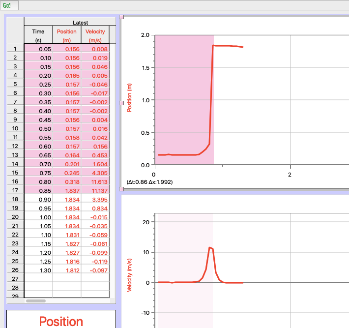
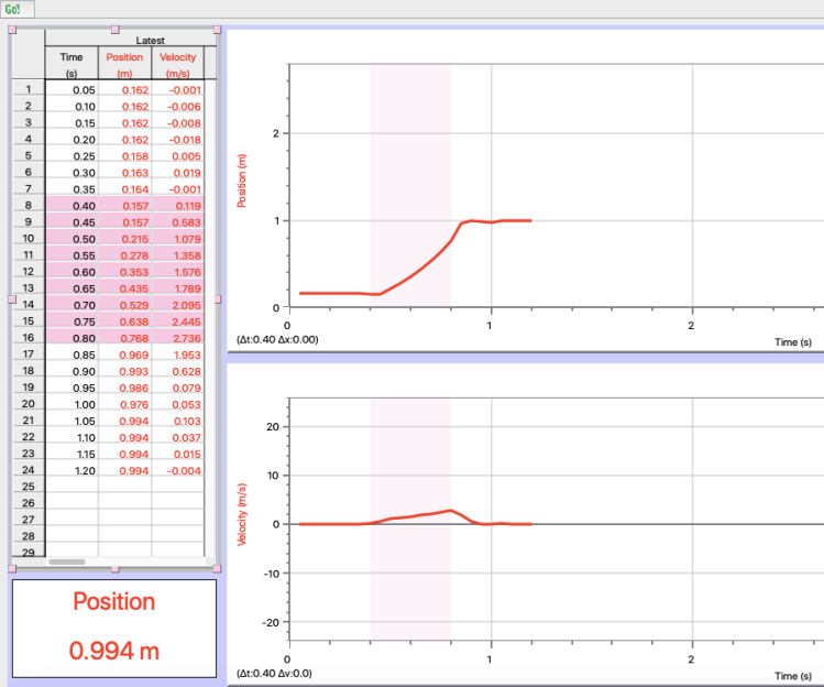
The following Logger Pro screenshots are examples of the kinds of data we received. If you know why we were getting y = -ax^2 + bx + c as the line of best fit, I’d love to hear it!