My first year of teaching Physics, we did not include momentum-impulse. Second year Physics, we briefly went through impulse quickly. This year, we had an actual unit and went through it. The wonderful Mrs. F brilliantly created some templates for students to work through some of these word problems. When I was in high school learning Physics, I was confused about the givens especially for initial and final situations. The algorithm of mathematics was easy, but comprehending and making sense of the word problems was the difficult part.
Because of the scaffolding Mrs. F created, the students were able to make sense of the problem and show it in multiple ways. They graphed mass-velocity graphs. They filled out a template. They showed their algebra. It’s all very brilliant.
Momentum-Impulse Schedule:
Day 1: Invention Task, WB Battles, Practice 1
Day 2: WB Practice 1, Discussion 1, Activity 2
Day 3: Quiz 1, WB Activity 2, Practice 2
Day 4: Questions- Practice 2, WB Practice 3, Egg Drop
Day 5: WB Practice 3, Car Crashes, Impulse-Momentum
Day 6: Review Momentum-Impulse & start Energy Unit
Today’s challenge was leading a group of colleagues in a PD. My past self signed up to lead something on tech. It’s probably me coming down from a learning high from #MERIT18. I was quite nervous to lead a PD at a high school level. I’ve done a couple PD sessions for unpacking Common Core for math at the elementary school level for people I’ve worked with for a very long time and one for using Catholic social teachings in math for a bunch of strangers. Doing this at a high school level…I felt like I was back in high school myself!
I talked about the difference between formative and summative assessments and my own philosophy on integrating tech. I did discuss how Participation grades weren’t a part of the classes I teach because it was hard to measure “participation” for a student trying to meet the standard: “I can analyze a Force vs. mass graph.” After explaining my own background and philosophies, I was able to move forward in the tools I use.
Today’s Professional Development was extremely successful at KCI at Foothill College. I learned some clear and helpful applications in teaching the “Hacking” portion of the Making, Hacking, & Tinkering class. We’re not quite at hacking stage yet, but hopefully, we can be. I relearned some important coding language protocols and how to think about programming. I do foresee some frustration with the students, as I experienced quite a few moments of frustration myself.
Personal Reflection: I’m pretty sure my college counselor during high school, Mr. Jim Patterson, would never say, “I told you so.” But I feel like he’s totally allowed to say it. I took Pascal as an elective during high school because it seemed fun and low risk. When I say that, I mean that my overall GPA probably wouldn’t go up or down too much. But then…I liked it! I had to choose between taking advanced dance or AP Computer Science (and learn C++). I got into a huge fight with my parents and Mr. Patterson about taking dance.
And now…here I am….looking for resources to teach Computer Science. Which…is highly exciting!
On Day 26, I went over with students how they were going to collect data. First, they needed to know the forces acting on the mass. We drew interaction and force diagrams on whiteboards, that the students ended up putting into their document. Then they were to place to the masses on the mass hook and then measure the Force of Gravity using the spring scale on the “N” side. They had to collect 5 pieces of data. We went over masses in grams and how to convert to kilograms, and what information they should write in our data table. For the most part, data collection went well. What did not go well was graphing and analyzing our data.
Data Analysis
To analyze our data, I asked the students to first find out what the SI unit of mass was. They found out (through our very good friend Google) that it was kilograms, and so we to re-discuss the conversion from grams to kilograms. Then we talked about IV and DV and how they related to x & y on the Cartesian plane. Then the HARD PART. Showing students how the graph translates to an equation was extra difficult. I’m not so sure what happened between now and two years ago. There seems to be a better understanding that the graph showed us an equation. I’m having trouble explaining how x & y are placeholders, and how they can help turn the graph into an equation. Although it’s a difficult concept, I don’t think it’s as hard and frustrating as everyone may think it is.
CER Writing
The claims have generally been fine. Last year, I think we wanted students to state the written relationship between the variables, and what it was called. Maybe we need to better explain what the difference is between Written relationship and what a slope is. When I taught algebra two years ago, I think I was able to articulate what the slope is much better, but I can’t figure out how/why. I did have some carry over students, and it helped a little? Evidence has been looking better and better. The students are showing their graphs and explaining the Evidence much better. The reasoning…oh the reasoning! I think this hybrid of standards-based and traditional grading isn’t working out well for the learning aspect. Students just want to know how to get a 100% for Reasoning, without looking at their passed rubrics to see what could be improved. Also, Reasoning is just plain hard. There seems to be a jump that students are having to make from the prewrites, lab discussion, and then to writing it on their own.
I wanted to hear student voices that don’t normally speak up in class to see if they really truly understand the concepts that we’re covering. The Forces unit usually is a make or break for the freshmen for the rest of the year. Few students can pull it together after Christmas vacation to improve on their work habits and physics practice. This starts from the very beginning of Forces.
With #MERIT18 and our department head’s combined efforts to use technology in the classroom, I thought that maybe using Flipgrid would be a good starter. I see my students using Snapchat or Instagram in class and taking weird photos of things or themselves to maintain a streak. So I thought, why not use the tool and make it meaningful. Surprisingly, most of the students were really shy and did not like the idea of having a selfie published…it confused me for a second, and then after a good night’s rest, I understood. Most of them did not want to look stupid in front of their peers or be perceived so negatively that they make it into someone else’s social media.
I used Flipgrid as as tool to have students explain the 3 different types of forces we discussed in class (Normal, Tension, and Friction). I was worried that the examples were going to look like each other. I was also worried that no one else was going to see their genius thoughts. As a “Do Now,” I asked students to reply to someone else’s explanation with a question and a praise. Most of the praises were very adorable and the questions were kind off topic like: “What forces do you see when you run?” (when there was nothing of that nature, but it was good question making practice). It was really cool to see students spotting some errors in language and thinking, and then asked the question- “Why do you say it that way?”
The rest of the forces discussion went well…much better than last year, I think because
students had to think about forces outside of class (and come up with examples)
students had to think about someone else’s reply to see if it matches up with their understanding.
So when it came time to draw interaction and force diagrams, it went so smoothly. Everyone was on the same page. There were very few content questions but more extended learning questions. Even the students who had been unsure about what was happening in class said that it was way easier to understand now. It really was exciting! Moving forward, I need to build in more opportunities for students to reflect on what they’ve learned.
Today, we had our Types of Forces discussion. I went over the slides that the wonderful Mrs. F created before I came to SHC about the types of forces we will use in class. I like this discussion because it allows students to DO some of the information we share. They get to actually experience how the particles of something might be moving when to surfaces are sliding past each other. Mrs. F is really great at having these great ideas of how to share the content with our students.
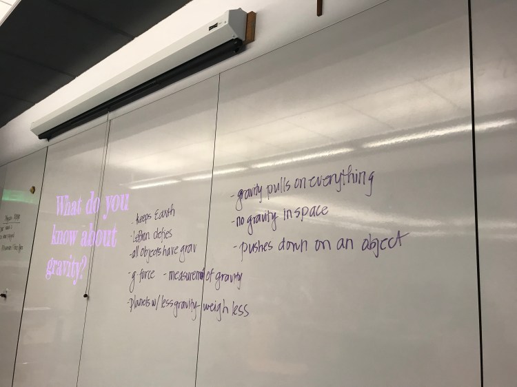
Then we came to gravity. I asked the students: “What do you know about gravity?”
Not sure if you can see it, but one of my students knows that LeBron defies gravity. Though I’m not a Lakers or King James fan, I threw it up on the board anyway. Most teachers I’ve had would have poo-poo’d it and would’ve said that it wasn’t appropriate. But if that’s all somebody knows about gravity…then that’s all they know. Value what students know and build upon it!
BONUS: I had students use flipgrid as an assessment of their takeaways from the class’s discussion. It is the cutest most adorable assignment ever. I can also clearly see what the students have learned/not yet learned. Thanks #MERIT18 for the confidence to allow me to assign this!
Last year, my colleage, Mrs. Freudenberg, did an activity with the students using materials and ideas from Kelly O’Shea (@kellyoshea)and Brian Frank (@brianwfrank). Unfortunately, I had a family emergency to take care of, so I don’t even have the memory of doing this activity. With it being my first time, there were a bunch of questions that came up, and I didn’t really know what to do with the questions. Then I remembered–I am trained in Modeling Instruction…utilize those skills!
I just started asking the questions back to the students that asked them, like: What interaction is this, Ms. M? My response: What do you think the interaction is? Since this is still the beginning of the unit, we’re not telling them anything just yet except maybe to give them some vocabulary of what interactions could be possible and to define what an interaction is. For the purpose of this assignment, we said that interactions are contact interactions.
Block 4: They were so worried about getting the right answer! Ms. M, the interaction for this station is…, right? They got really upset when I wouldn’t tell them. At the end of the period, when we were wrapping up, they were still pretty upset to find out that there was more than one answer. I’m going to need to figure out how to create a community that is okay with unknown answers. (maybe it should start with me)
Block 5: Block 5 had a different challenge. They were stuck on certain details. For example, one group got stuck on calling the hanging object a weight or mass. Then they couldn’t move on until they knew how much the “object” weighed. How to write evidence. What do you mean where the interaction is? We defined it as “touching,” but there seemed to be some difficulty understanding that touching between two objects is just between those two objects
Block 6: They were really tired after their test, and the room was hot. The same issues from Block 4 & 5 came up. This group seems to be really on top of things, and so they were mostly able to get through this activity without needing every single question answered. They discussed amongst themselves mostly.
Object suspended by two strings.
Object suspended by two rubber bands.Object on a ramp supported on two sides by foam.
.
Buggy spinning tires on a brush.Object being pushed across a brush.
Fan cart pressing on a hoop spring.
It was so fascinating. Especially the fan cart pressing on a hoop spring. Students chose the two objects to be the fan cart and hoop spring. The place of interaction of the two objects is on the track. They couldn’t see that they were introducing a third object into their two-object system. Which reminds me, I should make myself a mini answer key to remind myself what I want students to get out of it.
Being a #MERIT18 fellow, I have been feeling way more confident about my teaching and technology skills. It has been so amazing, that I’m coming back to work with a renewed sense of vigor after learning some skills. I have been honestly nervous about teaching MHT by myself without the awesome Mrs. C to guide me. Both the department head and Mrs. C have assured me that I’ll be fine. Growing up, I believed for a really long time that the teacher needs to be an expert in what they teach. Yes, I was pretty unforgiving to my elementary school teachers, who I believed needed to be an expert in all the subjects.
Back to the point. I was feeling pretty good with our 3D printing projects. I thought I’d test out a design to see if it’ll print properly. I took an already completed design from Tinkercad and printed a pumpkin candle holder using a makerbot Replicator 2 printer. It turned out okay. I should have taken the time to add supports in for the hole parts because it ended up cracking when we passed the artifact around in class.
The 3D printed model I did to make sure our printers were working.
One of the students DD, has had plenty of 3D printing experience from summer camp at Stanford. So he finished his design early and got all setup to print his first design. We found a spool that looked like wood. We thought it would look really cool since he designed a coffin. The supports printed out okay, then when it was left unsupervised, it stopped printing. Yesterday, I grew more and more frustrated. You will see photos of my frustration and failed attempts to print.
I went home defeated, and told my IT person what was troubling me. He listened very well, offered me snacks, and then told me that he didn’t know about 3D printers. He said that I sounded like I needed someone to listen. Then he offered to come into the classroom to take a look, and we can both do research. I declined the offer since he wasn’t actually employed by the school, but warned him that I will take him up on it if I got desperate.
This morning, I shared with the students what was frustrating me about the 3D printing unit. God bless each one of their hearts. They all offered solutions. Two students piped up and said that they have worked with a newer model of our printer and they feel confident about tinkering with it. Half an hour and few tape jobs later, our machine is back to work. Although the assignment wasn’t to fix the printer, they fulfilled one of the class’s goals. I emailed their parents to let them know how happy I was to have them in class. Allowing students to do their thing because each one of them brings something to the table– today was my reminder and a serving of humble pie.
Ironically, the project we were trying to print was a coffin cover.
If anyone has any suggestions, hacks, or anything to have the printer print better, I’m totally open and willing to listen!
Today, we whiteboarded some of the homework. I’m really glad we did, because although the students were able to regurgitate some information, there were some heavy misconceptions.
Misconception #1
Thought: The position is decreasing as the velocity is decreasing. The object is not accelerating because it is slowing down. Although the position is decreasing, it is still going in the positive direction.
We proved how the object, although decreasing in speed, continues to move in a positive direction. A student was able to show that the position was increasing, but I erased the photo of the explanation. He drew arrows to show that for each second, the position has increased from its previous place.
Misconception #2
Thought:The acceleration is decreasing as the velocity is decreasing.
It was really hard to convince the students that this graph was showing constant acceleration. During this very heated discussion, a student remembered that in the last unit, we had a straight line on our x-t graphs. That shows a constant velocity. Even though the position was changing, the velocity stayed the same. Here, it was way more difficult to convince them of that the rate of change of speed is staying the same, even though the speed is changing. I guess that concept is pretty difficult to digest, but I need to figure out a better way to show it to them.
Whiteboard Sample
These two students did a great job with their whiteboard. I asked them to send me the photo of their work since they were taking a picture of it. To their credit, they answered all my crazy questions:
How do you know it’s going in a positive direction?
It seems as though since the velocity graph is showing a positive slope, that the car would slow down going up the ramp. (They thought I was crazy…but I know there’s probably a student or two out there thinking it.)
In a position-time graph, if it’s slowing down, can it be going in a positive direction?
What does a negative acceleration mean?
What does a positive velocity mean?
I thought all the students did a wonderful job today, despite it being a Friday afternoon….VERY warm afternoon.
Today, we covered one of the most difficult labs this semester: Is it speeding up? Last year, or maybe every year, we think it’s really difficult. I opened up one of the labs from last year, and it looked really good. So this year, I think it’s going to go much quicker with some of the changes:
Brainstorming. This year, I had students discuss at table partners: What can you do to see if the car is speeding up? What information do you need? We came up with some great answers. The first group immediately went to, well we need the velocity at the top of the ramp and the velocity at the bottom of the ramp. The next two blocks struggled with this part.
Materials to gather data. We thought about what materials we’d need to find out what the initial and final velocities were (and students also insisted we find out the velocities in between). We tested out as a group how reliable it would be to have a human timer. (Note: if there were more days/time in the year, we would have the students figure out this out on their own rather than using a lot of guided questions.) Students decided that using a motion detector might be best.
Gathering Data. Students went into assigned groups and collected data using the motion detector. We discussed some rules about using the motion detectors (such as, the car should be seen by the motion detector).
Data Tables. We had students collect data in their packets so that we would only have one computer out with Logger Pro, and everyone else engaged in the activity without the temptation of the Interwebz. I walked around and helped students determine which part of the Logger Pro data they should use. Some groups figured out what part of the graphs they should use. Hopefully, next year, we’ll be at a better place so that they can take the time to figure it out.
Analyzing Data. I created an equation sheet for them to use to see which line of best fit they should use. And we had conversations about the kind of graph that would best fit the dots on their Desmos graphs.
Conclusion: Ms. F, who teaches a couple doors down, came in to check on the data that we were getting. Her students were getting terrible velocity-time graphs. As soon as I said that, I checked my graphs, and they were equally terrible. For whatever reason, the line of best fit was y = -ax^2 + bx + c. The first block of the day, I had them make their whiteboards, but then realized later that their whiteboards needed information that would come up from the discussions.
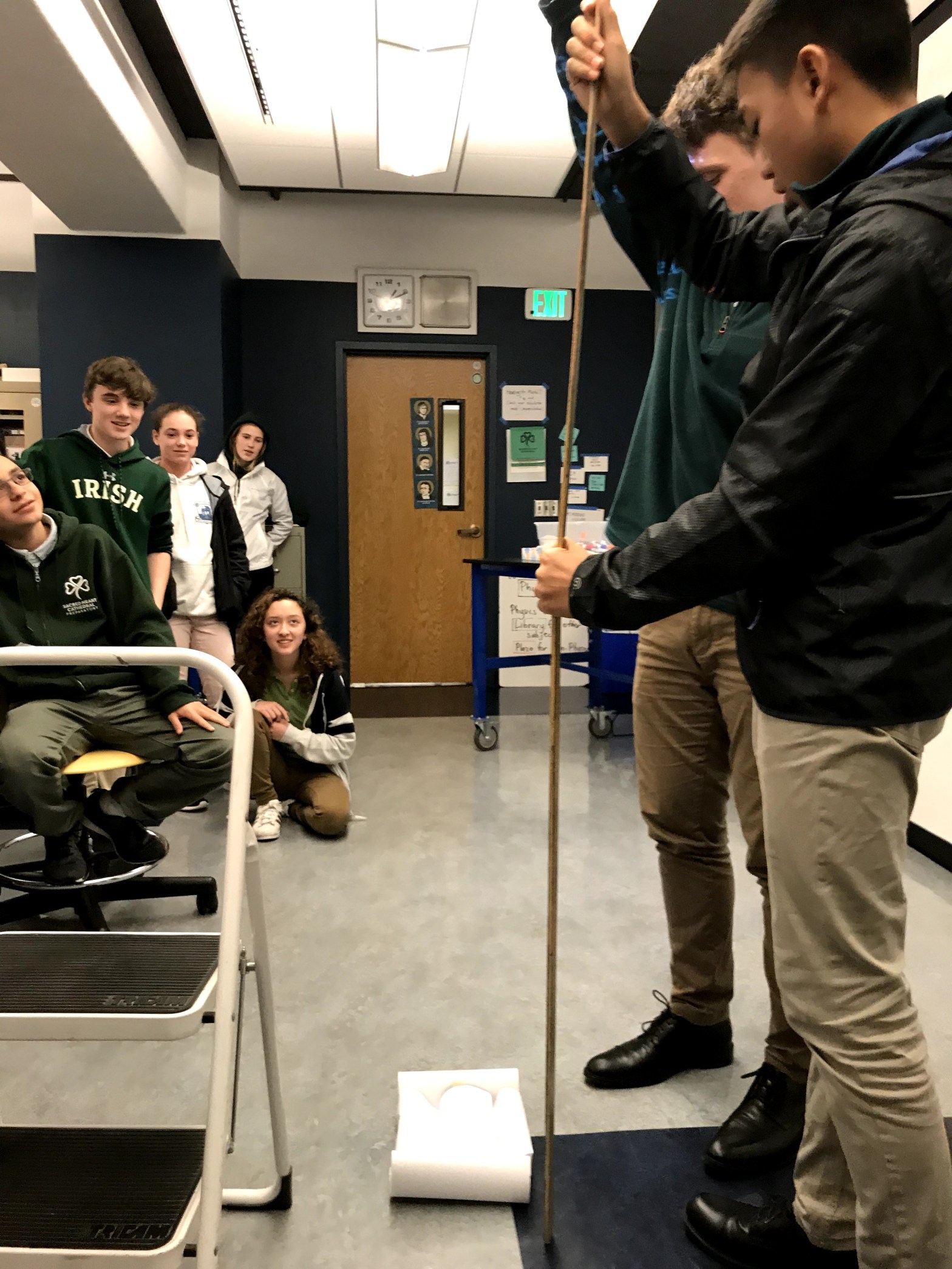
Took a picture of what their boxes should look like before and after the lab.A student with his group’s setup.
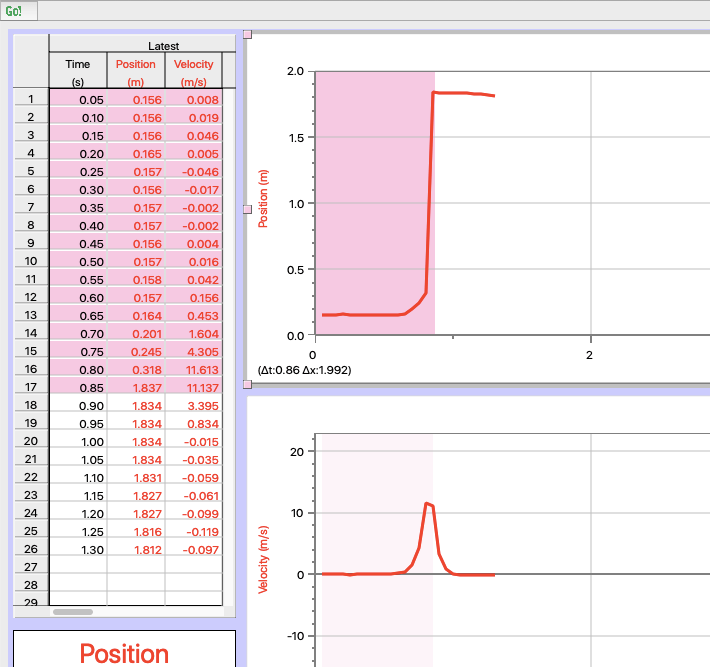
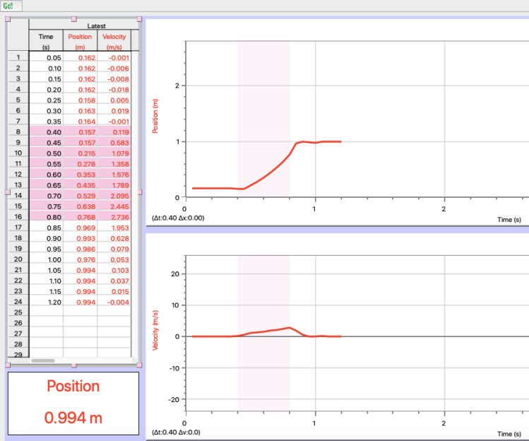
The following Logger Pro screenshots are examples of the kinds of data we received. If you know why we were getting y = -ax^2 + bx + c as the line of best fit, I’d love to hear it!


 Thought: The position is decreasing as the velocity is decreasing. The object is not accelerating because it is slowing down. Although the position is decreasing, it is still going in the positive direction.
 These two students did a great job with their whiteboard. I asked them to send me the photo of their work since they were taking a picture of it. To their credit, they answered all my crazy questions:


You must be logged in to post a comment.